Sentiment Analysis Pipeline
Project Overview
This project focuses on developing an NLP-based sentiment analysis pipeline designed to extract public sentiment from X (fka Twitter) about specific stocks or the market as a whole. Access the project repository here.
The objective is to build an end-to-end, cloud-native MLOps pipeline capable of performing real-time sentiment analysis on tweets. By leveraging fine-tuned LLMs such as BERT and GPT, the model aims to integrate sentiment insights with stock market trends to predict short-term market performance.
Tasks
- Developing an end-to-end MLOps pipeline for real-time sentiment analysis using NLP techniques and fine-tuned LLMs (BERT/GPT), integrated with stock trends to predict market performance.
- Leveraging data pipeline tools (Spark, Flink) and cloud-native MLOps (AWS SageMaker) to deliver scalable ML models.
Tip: Start Small and Build Gradually. When approaching a new dataset or project topic, especially for the first time, starting with a small-scale, working mini-project can be helpful. This preliminary approach allows us to gain hands-on experience with the data or subject, helping us better understand its nuances without the commitment of a large-scale effort. By creating a manageable initial version, we can focus on essential components, identify potential challenges, and, importantly, see some early results. This can be invaluable for steering the project in a direction that is both practical and insightful.
Data
The dataset used for this project, available here, is sourced from the zeroshot account on Hugging Face. It contains an annotated corpus of 11,932 financial tweets in English collected using the Twitter API. The sentiment labels are: 0: Bearish, 1: Bullish, and 2: Neutral, making it highly relevant for understanding market sentiment. This dataset serves as a foundational component for training and fine-tuning the sentiment analysis models used in this project. Below is a code in Python3 to directly load the dataset into your notebook:
# Import necessary libraries
import pandas as pd

# Load the datasets from GitHub
train_url = "https://raw.githubusercontent.com/miladparvaneh/Sentiment-Analysis-Pipeline/main/Data/train.csv"
valid_url = "https://raw.githubusercontent.com/miladparvaneh/Sentiment-Analysis-Pipeline/main/Data/valid.csv"

try:
    # Load the training data
    train_data = pd.read_csv(train_url)
    print("Training data loaded successfully!")

    # Load the validation data
    valid_data = pd.read_csv(valid_url)
    print("Validation data loaded successfully!")

    # Display the first few rows of the datasets
    print("First few rows of training data:")
    print(train_data.head())
    print("\nFirst few rows of validation data:")
    print(valid_data.head())
except Exception as e:
    print(f"An error occurred: {e}")
Exploratory Data Analysis
Exploratory Data Analysis (EDA) is a critical step in understanding the structure and characteristics of a given dataset before diving into modeling. For this project, I am starting by loading and inspecting the dataset to understand its dimensions, data types, and overall structure. I visualize key features such as sentiment distribution. I am also handling missing or inconsistent data, identifying outliers, and preprocessing text data by cleaning, tokenizing, and analyzing word frequency patterns. These steps help uncover initial insights, detect potential issues, and guide the design of the sentiment analysis model.
tasks
- Basic Statistics & Data Quality Checks: Label Distribution, Missing Data, and Text Length.
- N-gram Analysis for Common Terms.
- Text Preprocessing and Cleaning.
- Text Embedding Visualization.
Label Distribution
Analyzing the distribution of sentiment labels in both the training and validation sets gives us an insight into whether there is an imbalance in sentiment labels, allowing us to decide if any balancing techniques (e.g., oversampling, undersampling) might be necessary. The figures below contain bar charts for each dataset, showing the number of instances for each sentiment label:
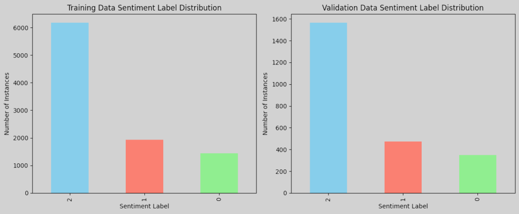
Do we have an imbalanced data? Although there is not a strict, universally accepted threshold to define class imbalance, common guidelines, e.g., the 70-30 Rule and 1:2 or Greater Ratio, are often used to assess it. The 70-30 Rule refers to when one class constitutes more than 70% of the data. A class ratio of 1:2 or higher, e.g., one class has twice as many samples as another, can also indicate an imbalance, depending on the use case. In practice, it is about evaluating whether the minority classes have enough data for the model to learn meaningful patterns. For NLP tasks, imbalance can often be managed if each class has at least a few hundred instances, which is the case here. With Neutral being much higher than the others, it is reasonable to treat it as imbalanced and consider the following techniques to improve model performance across classes if necessary:
- Resampling: Oversample the Bullish and Bearish classes or undersample the Neutral class in the training data. It is important to be cautious with oversampling in text data, as simply duplicating minority class samples can lead to overfitting. To mitigate this, we can consider using data augmentation techniques, e.g., synonym replacement and back-translation, to add variety.
- Class Weights: Assign higher weights to the Bullish and Bearish classes in our model’s loss function to penalize the misclassification of these underrepresented classes. This is common in NLP and avoids creating duplicate text data. It can also be easily implemented in frameworks like TensorFlow/Keras and PyTorch.
- Synthetic Data Generation: Use techniques like SMOTE (Synthetic Minority Over-sampling Technique) to generate synthetic samples for the minority classes.
Missing Data
We check for null or missing values in the dataset for both the training and validation sets. If there are missing values in essential columns (like the tweet text or sentiment label), we can then decide how to handle them, such as by dropping rows with missing values if only a few are missing or imputing values for non-text fields. Upon checking the datset, no missing data were found.
Text Length
To analyze the distribution of tweet lengths, we can calculate the length of each tweet in terms of characters and words, then plot histograms to visualize these distributions:
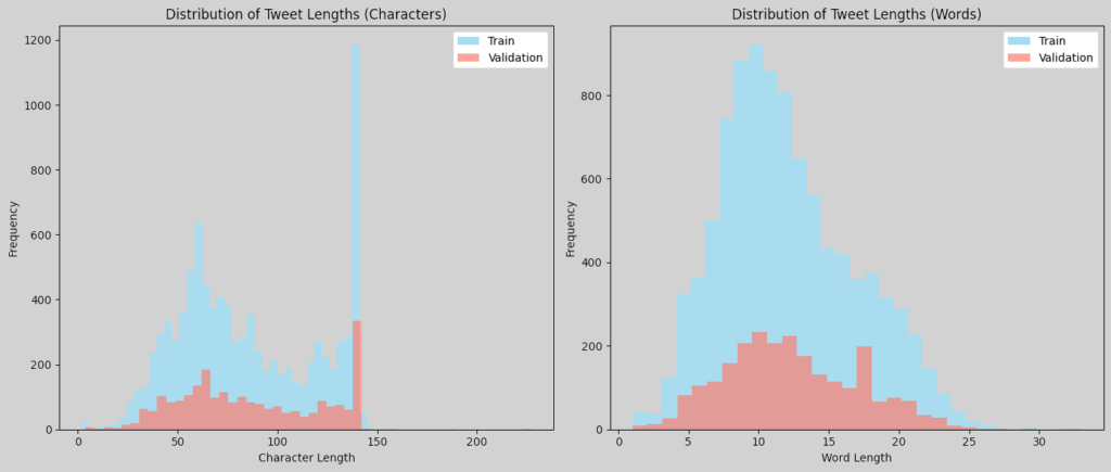
These plots will give us insight into the typical length of tweets in characters and words, helping us decide on text preprocessing steps like padding or truncating for input to models. The word length histogram exhibits a distribution resembling a normal curve, indicating a consistent average length across samples. Similarly, the character length distribution follows a comparable pattern within the 0-to-120 character range. However, an interesting trend emerges beyond 120 characters, where the number of samples increases, peaking at the historical cap of 140 characters. This suggests the influence of Twitter’s original character limit on tweet composition.
N-gram Analysis
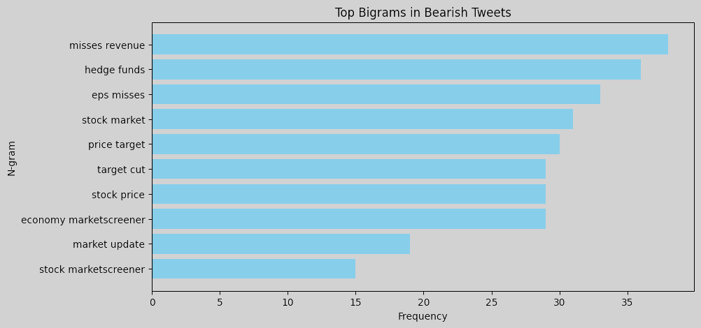
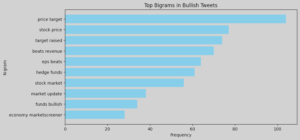
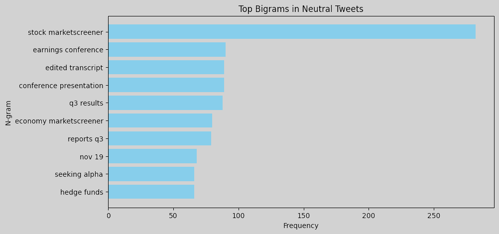
N-gram analysis helps identify commonly used words and phrases in tweets for each sentiment. Word clouds or bar charts of unigrams and bigrams can help understand language patterns associated with each sentiment. For instance, bearish tweets might contain words or phrases related to market downturns, bullish tweets may emphasize positive outlooks or potential growth, and neutral tweets likely contain general or factual terms without a strong sentiment lean. To perform an n-gram analysis, we can create unigrams and bigrams for each sentiment label and visualize the most common ones. Here are the resulting figures:
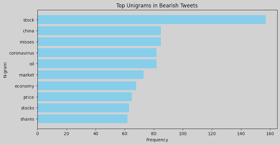
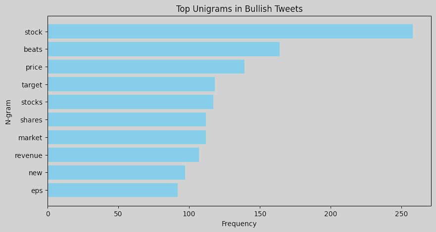
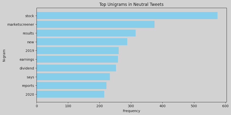
Unigrams: Words like misses, china, coronavirus, and oil show that bearish tweets often reference negative events or economic factors, such as global trade issues, pandemics, and commodity price concerns. Words like beats, price, target, and revenue suggest a focus on favorable financial outcomes in bullish tweets. The term new may indicate excitement about new market opportunities or developments that investors perceive positively. Neutral tweets are dominated by words like marketscreener, results, earnings, and dividend, which reflect neutral reporting language typical of financial updates.
Bigrams: Common phrases like misses revenue, hedge funds, and eps misses indicate that bearish tweets are often centered around negative financial news, missed earnings, or performance below expectations. In bullish tweets, bigrams such as price target, target raised, beats revenue, and eps beats are prominent, pointing to a positive sentiment related to surpassing financial targets and favorable earnings reports. Neutral tweets feature terms such as stock marketscreener, earnings conference, and edited transcript, which indicate more factual or event-based information, like links to reports or summaries.
Overall, bearish tweets tend to use language reflecting disappointment or downturns, with a focus on missed targets and economic concerns. Bullish tweets focus on success and growth, with frequent mentions of beating expectations, rising prices, and new developments. Neutral tweets are more report-like, containing objective information, links, or summaries without a strong positive or negative tone. This n-gram analysis provides insights into the language patterns associated with each sentiment, which could be useful for feature engineering in a sentiment-driven model. We could consider using some of these specific terms as features to improve the model’s ability to differentiate between sentiments.
Note: To remove links (starting with https or http) from the n-gram analysis, we can preprocess the text by removing URLs before performing the analysis.
Text Embedding Visualization
We can use techniques like TF-IDF, Word2Vec, or even BERT embeddings to visualize clusters of tweets by sentiment in a 2D or 3D space (using PCA or t-SNE). This could reveal whether there is a natural separation between sentiments based on tweet content. Here is the workflow:
- Text Embedding: Convert tweets to vector representations using embeddings such as TF-IDF, Word2Vec, or BERT.
- Dimensionality Reduction: Use PCA or t-SNE to reduce the embeddings to 2D or 3D space.
- Visualization: Plot the reduced embeddings with labels to visualize clusters based on sentiment.
Here is the figure when TF-IDF embeddings and t-SNE are adopted:
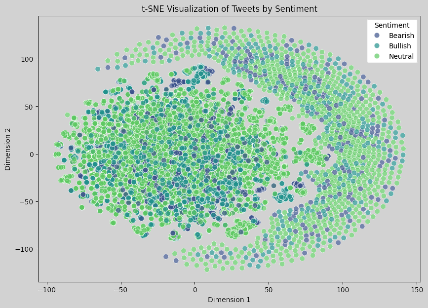
In the t-SNE visualization output, there is not a clear separation between the clusters for different sentiment labels, which suggests a few possibilities:
- Semantic Similarity Across Sentiments: The tweets in this dataset may contain similar language across sentiments, especially in finance, where many terms (like stock, market, price) appear in tweets with all sentiments. This overlap in vocabulary can make it harder for simple TF-IDF-based representations to distinguish sentiment.
- Limitations of TF-IDF for Semantic Representation: TF-IDF embeddings capture word importance but do not fully represent the nuanced meaning or context of words. For sentiment analysis, especially in finance, more advanced embeddings like BERT or Word2Vec might capture context better, potentially yielding more separable clusters.
- Challenge of High-Dimensional Data: t-SNE reduces high-dimensional data to two dimensions, but it might not always capture the true structure of complex data distributions. The lack of clear clusters could reflect that the sentiment structure is inherently complex or not easily separable in this dataset.
Here is the image for using BERT embeddings and t-SNE:
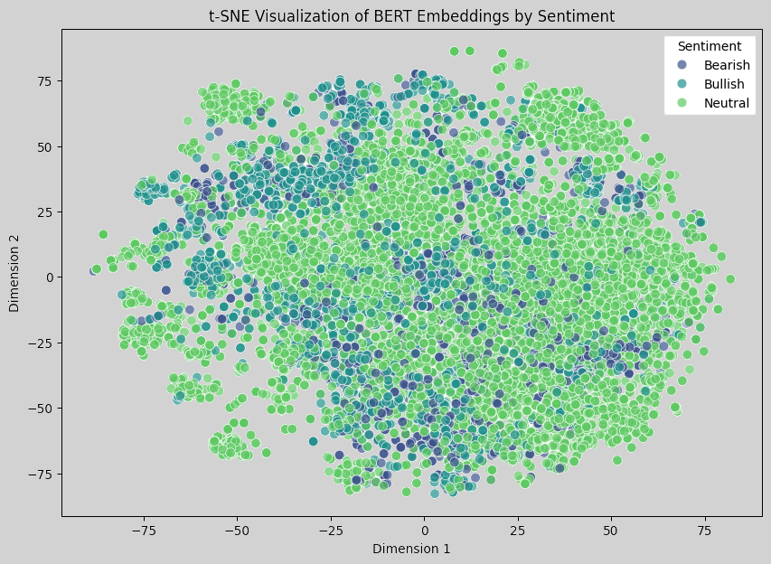
The t-SNE visualization of BERT embeddings still shows a significant overlap between the different sentiment classes. However, compared to the previous TF-IDF visualization, BERT embeddings should theoretically capture more semantic and contextual information, even if it is not immediately apparent in this 2D projection. This suggests that the sentiments may share substantial vocabulary and context, making it hard for even a context-aware model like BERT to distinctly separate them in 2D.
Most data points cluster in the center, indicating that sentiment classes are semantically close. This may reflect that finance-related tweets often contain similar terminology across different sentiments. Also, some bearish and bullish tweets appear more distinct at the edges, which might indicate an improved representation of certain unique cases.
Overall, the dataset might inherently lack strong distinctions in language between sentiments, especially in a short text format like tweets. Moreover, reducing high-dimensional BERT embeddings to just two dimensions may lead to a loss of information. In high-dimensional space, these embeddings likely have better separability.
Ideas
To further explore sentiment classification, we can consider:
- Training a Classifier: Rather than relying on visualization, we may try training a classifier on the BERT embeddings and evaluate its performance (e.g., accuracy, F1-score) to see if it can effectively distinguish between the sentiments.
- Using a Larger Model: If performance is low, we can consider fine-tuning a BERT model on the dataset, which can help it learn domain-specific nuances.
- Exploring Other Visualization Methods: We may also try UMAP instead of t-SNE, as UMAP might capture the structure of high-dimensional data differently and could yield a more separable visualization.
Further details will be provided as the project progresses.
